Tips and tricks for adding depth and perspective to your seascapes
Painting seascapes can present unique challenges in terms of creating depth and perspective. If you’re looking to create more expansive paintings seascape paintings, here are five things to pay attention to in your work. Follow along as I walk you through how to apply these observations to a seascape painting.
Artist’s Toolkit
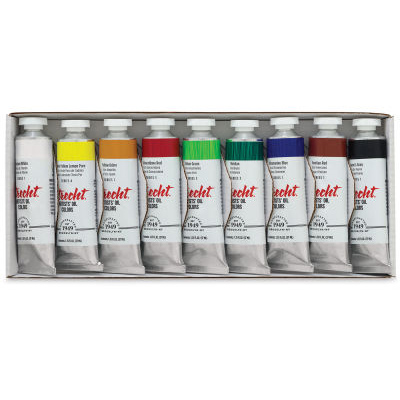
OIL PAINTS: titanium white, yellow ochre, cadmium yellow, phthalo blue, quinacridone magenta, Utrecht vivid purple deep Payne’s gray
SURFACE: 9″ x 12″ Legion Oil Paper
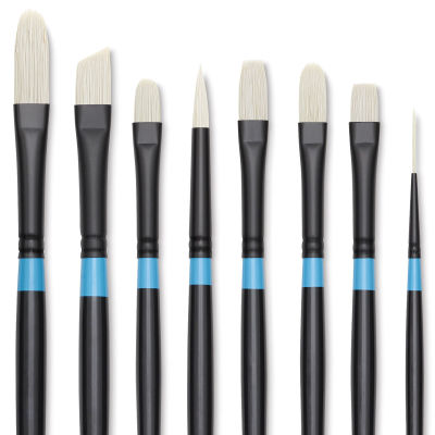
BRUSHES: #4 Filbert, #12 Mop, Makeup Brush
ADDITIONAL: Odorless Solvent and Paper Towels
Need Supplies? Buy Them Here!
Seascape Painting Demonstration
1. Perspective
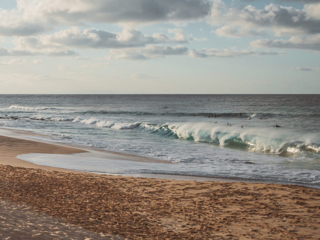
Look for the basic perspective lines. In this example, the cresting waves are parallel with the shoreline. If the waves in your subject aren’t parallel with the shore, they would generally be parallel with each other. This means that from the shoreline to the horizon, the receding rows of waves would share a common vanishing point.
2. Color and Saturation
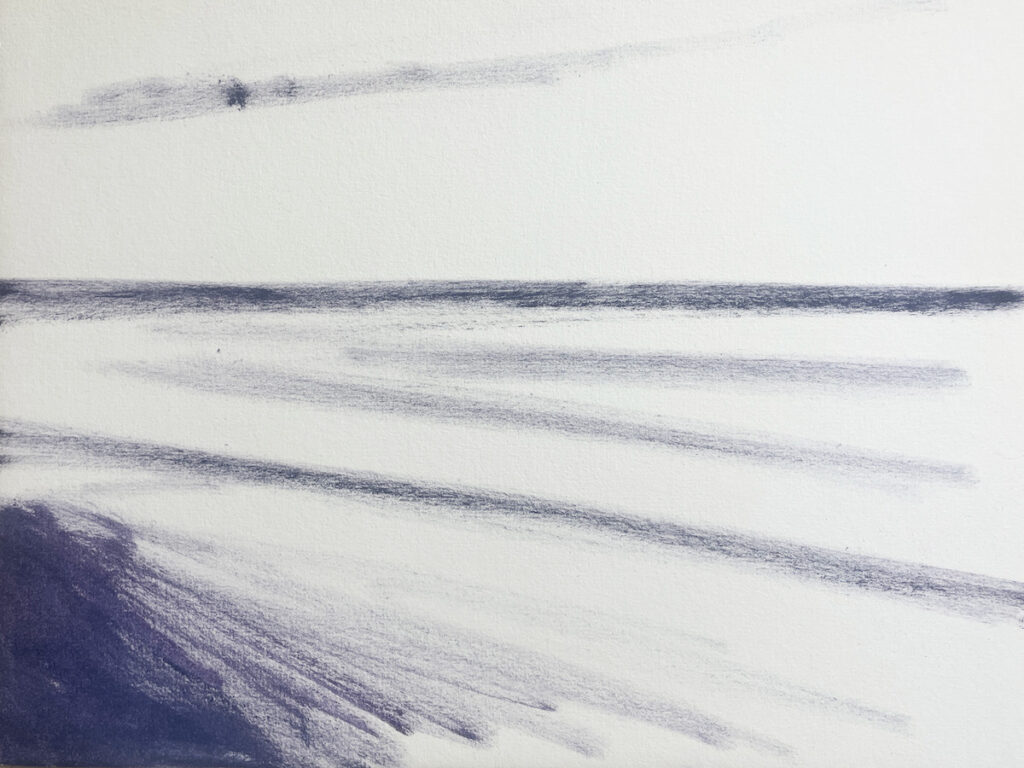
Pay attention to color temperature and saturation, particularly at the horizon. The sky at the horizon is often less saturated and can become warmer, depending on the specific lighting situation. In this case, I achieved this effect by scumbling a layer of light orange on top of the blue base layer. The water at the horizon often appears darker than it is, because the sky is relatively light in value. Comparing this to the darks in the foreground, I made the dark areas in the cresting waves darker and more saturated as they advanced.
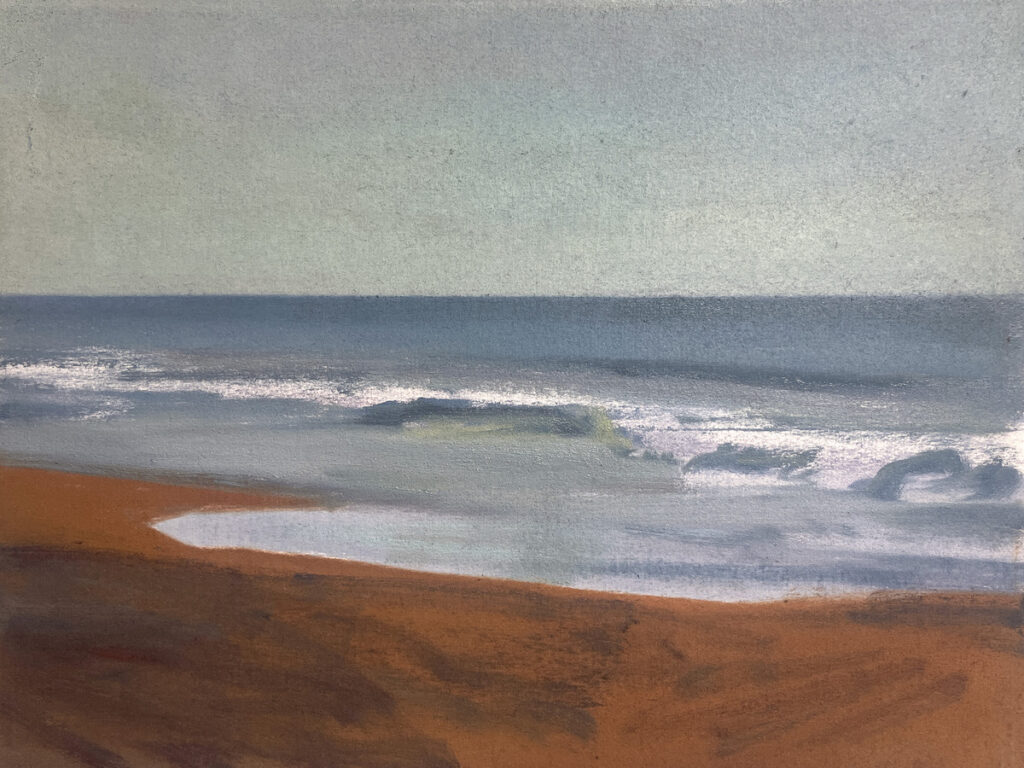
3. Scale
The next element to focus on is scale. I made my marks bigger in the foreground and smaller and tighter as they receded. When working on an ocean surface, keep in mind that you’re observing a plane that recedes a great distance while only accounting for a short vertical distance on the canvas. In the reference photo, this area might appear somewhat flat, so to create depth, spend time observing the subtle difference in the scale of the texture as the waves recede.
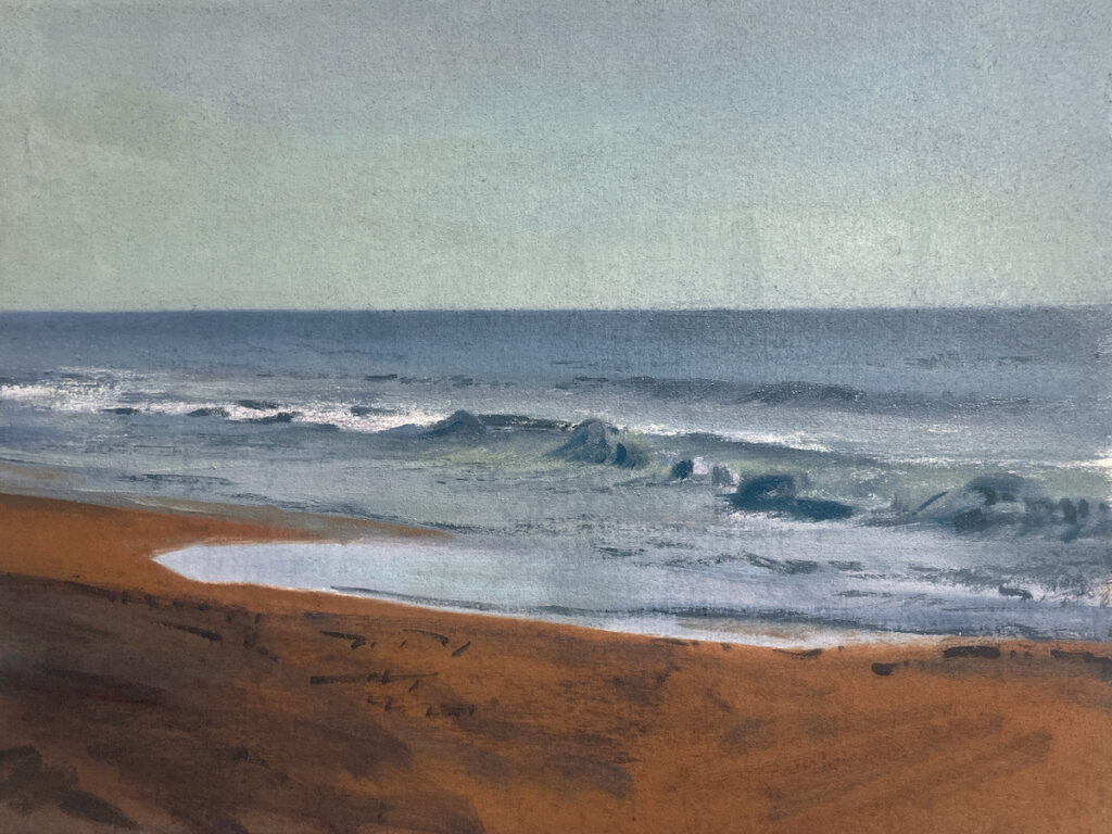
4. Edges
The horizon line is sharp in the reference photo, but softening it helped to push it back. By contrast, sharpening the edges in the cresting waves brought them forward. To soften the horizon line, I used a mop brush and my finger. The cresting waves in the foreground were created by pushing down into the base, lifting vertically, and lightly dragging toward the back side of each wave. Softening the back side of each wave further helped to suggest the sea spray and created more contrast between the edges in the painting.
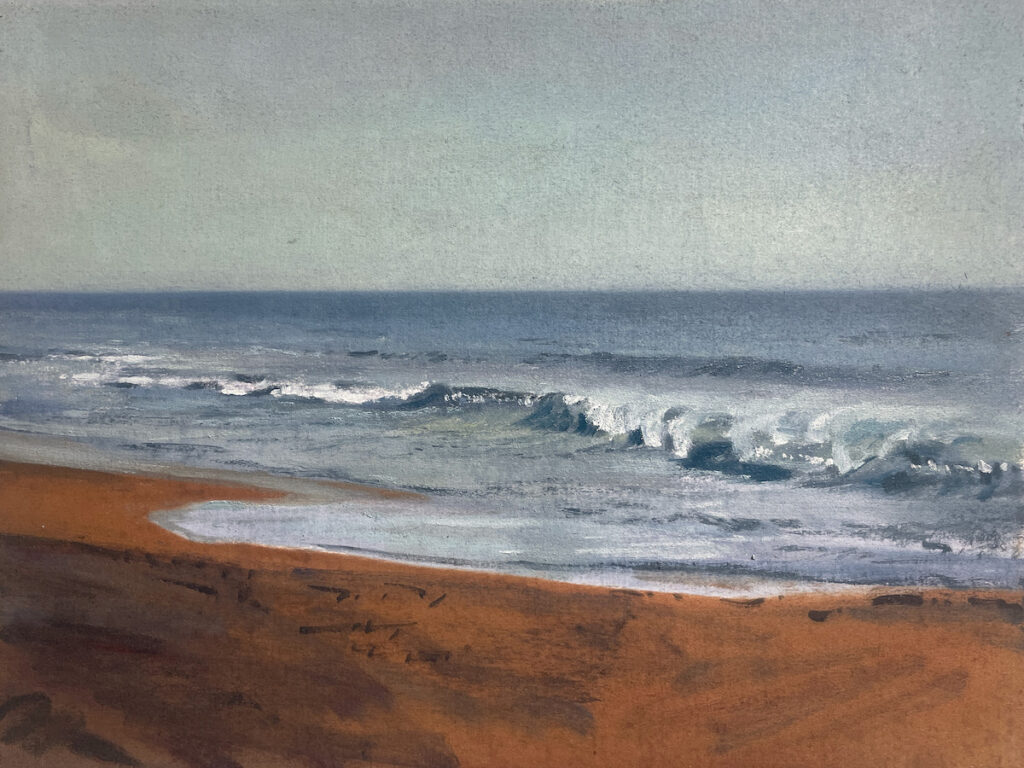
5. Texture and Final Details
Finally, look for contrasting textures between the sand and water. I switched to a palette knife to emphasize that contrast and bring the sand forward by creating contrast against the brush strokes in the water and sky. Starting with the highlights, I lightly scraped the palette knife across the paper, following a path I imagined the knife would take if it were conforming to the undulating surface of the sand.
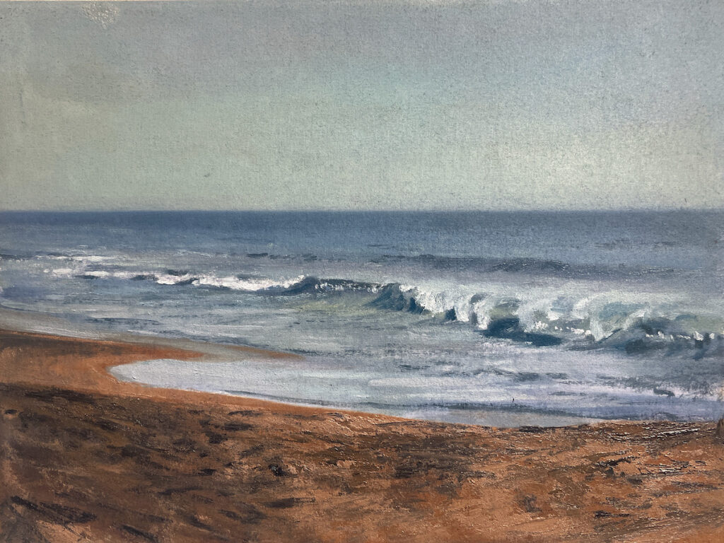
.
Try this demo for yourself and share your experience in the comments below! What are some of the things you look for when creating depth in seascapes?
This article contains affiliate links that help us earn a small commission from purchases — at no additional cost to you. We are grateful for your support.

